
In a world of broadband internet and fast hardware, optimizing websites and web applications can seem like a meaningless task. But what can the extra code you are sending your clients really cost? After reading In Defense of Optimization Work, I set out to revamp this very website, just to see how much cruft could be removed.
Over the course of this article, I will discuss several ways this site has sent meaningless bits to your browser in the past, and ways I went about fixing them. Many of these optimizations you may have heard of before, but thought to be to complicated, or a rabbit hole to go down. I will attempt to show just how easy some of these optimizations can be, and who knows, you just might learn something.
Getting Started
The first step I always take when asked to optimize a website is load up my browser’s development tools. For Chrome and Firefox, it’s some random combination of Cmd + Shift + Alt and the letter I. Usually, I forget exactly which combination it is, and have to resort to button mashing. But after doing enough work on the web, the key combination becomes second nature and you don’t even remember what it is.
The first tab I check out is the network tab. It is what describes all the parts of your website, and can provide insight into which parts take the most time when loading a website. You can see how long each part takes to download, how large each asset resource is, and where your loading each asset from. This helped me prioritize items that can be fixed on my size.
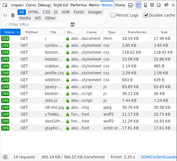
This is the network tab before making any alterations to the home page of this site. We can see the following totals for each type of data sent to the browser. Through the rest of this article, I will discuss how to reduce the affect of each on the overall site load time.
| Resource | Size | Files |
|---|---|---|
| CSS | 149.8k | 6 |
| JavaScript | 127.5k | 3 |
| Fonts | 40.27 | 3 |
| Images | 30.76k | 1 |
| HTML | 18.2k | 1 |
| Total | 363k | 14 |
JavaScript
After reading The Cost of JavaScript and having personally optimized several web applications, I knew the first beast to deal with would be that 127.5k of JavaScript. If you haven’t read that article, I strongly recommend it for anyone performing web optimizations. Go ahead, and read it… don’t worry, I’ll wait.
…
…
…
Okay, good read huh!
ALL BYTES ARE NOT EQUAL.
200KB of JS != 200KB of JPG
Great quote! And so powerful in image form!
Anyway, turning my attention to those 127.5k of JavaScript, I was wondering why they even were there. The jQuery is to support Bootstrap and I’m the Bootstrap code is to support some component on the site.
I commented out the script tag in the main template file and started browsing the site. After a few minutes, I found nothing. Everything seemed to be fine, without any script loaded. Until… I resized my development tools panel and the screen went into xsmall width selector mode in Bootstrap. Here, my site goes from being a side-by-side site to a single page scroll-er with a navigation bar at the top. Or put visually…
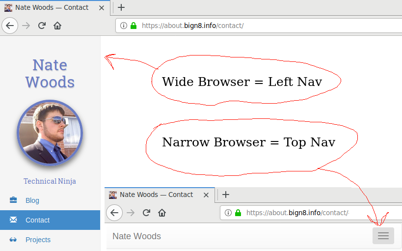
That’s right, that little navbar at the top of the page requires 128k of JavaScript to be loaded for it to expand when the hamburger gets clicked.
After a quick bit of research I found the bootstrap component that drives that navbar, collapse.js. Now I know what I needed to replace to reduce the amount of JS loaded on the site.
Before anybody goes off in the comment section: yes, I could do a custom build of Bootstrap that only contains the JavaScript for the component I needed. That would be fine, but in Bootstrap 3, I still would need to load all of jQuery to make it work. So I kept on hunting…
A long time ago, I ran across a website: You Might Not Need jQuery and have been coming back to use it ever since. Yes, jQuery is an easy to use web toolkit, but sometimes, it’s just too much for small little things… Like a navbar hamburger.
After perusing the Bootstrap code, simplifying it a bit, and converting it over to vanilla JS, I produced the following beauty!
var ele = document.querySelectorAll('[data-toggle="collapse"]');
var all = document.querySelectorAll('.collapse');
ele.forEach(function(el) {
  el.addEventListener('click', function(e) {
    all.forEach(function(el) {
      el.classList.toggle('show');
    });
  });
});
Yes, it’s not the exact implementation of Bootstraps collapse, but it was enough to work for my site. And with that, I was able to replace 127k of JavaScript with 605 bytes. Now that is an improvement!!!
That being said, something just wasn’t sitting well with me. Then my inner UX personality kicked me in the head: Why do I even need a navbar hamburger? I’m collapsing 3 links that could easily fit on the navigation bar. So, after fighting with a bit of CSS to get everything in place… I had it, a full website, in 2019, that didn’t require JavaScript for layout or mobile device handling. And an added bonus of no Hamburger, Vegans everywhere rejoice.
Long story short for JavaScript: disable it, see whats broken and try to replace it with less code. Even better if you can remove it entirely.
Fonts
Alright, now the designers among you are going to hate me for this one, but here goes nothing.
When it comes to fonts, ask yourself if you really need them. My site had 3 fonts being loaded: Glyphicons from bootstrap and 2 different weights of Roboto Slab. Do I really need those 40k of assets just to render a few glyphs in a fancy way?
Option 1: I don’t need the fonts
Great! replace them with a reasonable web-safe font, and move on to the next section.
This is what I was able to do with Roboto Slab Bold, after I realized the single character being render with it, probably wasn’t worth the 10k of font required. For this, I considered replacing the font with a simple SVG path of the glyph, but even that seemed excessive, so I fell back to using an Arial i instead of a Roboto Slab Bold version.
Option 2: I need the fonts!
Okay, okay, jeez, calm down. You can still optimize the fonts if you MUST have them.
For me, since Roboto Slab was only used on the sidebar, I only rendered the text Nate Woods and Technical Ninja in the font, along with a bold i if you hover over my face.
Luckily, with Google’s Font API you can optimize your font request by telling them exactly what text your going to render. Then, they can subset the glyph, the char map and kern tables in the font to only include the data you absolutely need to render those code points.
Also, if your not using Google Fonts, make sure your using one of the woff standards. Most modern web browsers support them and it can really save in the amount of data as each table within the font is compressed independently (depending on if the compressed version of the data is in-fact smaller than the raw data) and sent to the browser. WOFF compression can be done before page load, and you can serve these fonts as static assets.
If your interested in converting TTFs to WOFFs, I found fontello’s ttf2woff node.js script a huge help. Personally, my servers are written in go, so I took the time to convert it to go (source coming soon), but it was a good starting point to see how the tables work together.
Fonts Wrap Up.
For me, I had to take a long hard look at my site to decide if the 40k of fonts was worth it. In the end, I decided to take all the non-standard fonts out of my site. If I need to, I’ll bring back my few GlyphIcons with SVG versions of the particular glyphs I need (thanks for including that in your release bundle Bootstrap!). Also, if your interested in a font glyph explorer, I found Glyphr Studio to be somewhat helpful in my font exploring endeavors.
In summary, fonts are an annoyance for everyone involved, so use them as little as possible and everybody wins.
Images
You have reduced the number of fonts and eliminated as much JavaScript as possible… whats next?
This is one of the steps I always forget: to take a look at the images on the site. Most people just take an image and slap it on the page and say… “yep looks great!” and move on to the next thing. Unfortunately, images can kill the load time of a site, especially if you put a high-res background on your site.
For me, it’s my little profile picture just to the left there… Look how pretty I am!
Unfortunately, that picture, has only been cropped square so it could be made into that circle. Yep, that 30kb image is original quality folks, from back when I had a flip phone! Looking at the development-panel, I found the picture was 343x343, which sounds fine, until you look at the CSS and see that image will always be 125x125! That simply will not do! Time to cut that baby down to size.
Good thing the good folks over at ResizeImage.net have built a web-app to do all the hard work for us! After uploading the image, and resizing it for the intended size, its time for the most important part, discovering exactly how far you can turn down quality while still maintaining a reasonably clear images. With their app, this couldn’t be any easier, I just took the slider down to zero, hit Resize Image followed by View Image, and gradually increased the image quality until I got a self portrait I could stand to look at. For me, the magic number came in at 40% compression, which gave me a 2.68 k image that was the perfect size!
Images can account for a ton of bandwidth and drastically increase the time to load for your website, especially for mobile users. So make sure they are optimized for the size the are presented in, and compressed as much as is bearable.
Styles and HTML
Alright! You made it this far! Time for the big one… redoing the styles of your website!
Yes, it’s super easy to throw Bootstrap on, and just override what you need. But Bootstrap is heavy, it has styling for every conceivable form input element out there… And this site doesn’t have any forms!
This one takes the most time for me, but my process is to turn off all the CSS and build up from scratch. This site is simple enough that it should only take me a day (or a weekend if I stop to write the article in the middle of doing it). But this is also a perfect opportunity to optimize the HTML the styles are riding on as well.
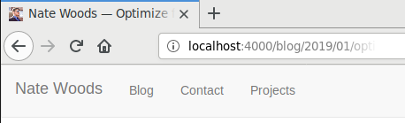
After turning off all the CSS, I found my mobile navbar (remember that hamburger?) and full width navbar were actually two separate copies of nearly the same content. Additionally, since I would be rewriting most of the styles, I decided to leave the comfortable grid structure, containers and rows that Bootstrap offers behind. Instead, I chose to just represent the the content as simply as possible. Also, it’s 2019, I need to upgrade my tags to be truly HTML5, who cares about IE6 anyway.
So, I took out the 9 layer deep navbar out, and replaced it with the minimal tags necessary to present the given content. Wrapped it all up and ended up with the following basic structure.
<!DOCTYPE html>
<html>
  <head><!-- all the fun stuff --></head>
  <body>
    <header>
      <!-- special profile picture component -->
      <nav>
        <ul>
          <li><a href="/blog/">Blog</a></li>
          <li><a href="/contact/">Contact</a></li>
          <li><a href="/projects/">Projects</a></li>
        </ul>
      </nav>
    </header>
    <main><!-- content goes here --></main>
    <footer><!-- copyright goes here --></footer>
  </body>
</html>
Pretty dang simple if I do say so myself!
After that, it’s just a matter of rebuilding the styles. For that, I just did it piece by piece. Got the major layout of the side panel and right content in.
header {
  position: fixed;
  top: 0;
  bottom: 0;
  left: 0;
  display: block;
  width: 200px;
}
main {
  margin-left: 200px;
}
And yes, I’ll be formatting the sidebar as a title bar again, with conditional width CSS queries… later.
After that, I just browsed the site for a bit, and pulled over any content styles I needed from the old CSS where necessary. And presto-chango, I was able to replace nearly 140k of Bootstrap with <10k of CSS! Even with syntax highlighting CSS. Now all I need to do is make a Dark skin, it’s 2019 after all.
So, for CSS and HTML optimization, just turn of all the styles, represent your content in the minimal possible markup, and slowly start adding styles back in as necessary.
Conclusion
Where did we end up? Well, I haven’t finished the CSS completely, so take this with a grain of salt (or just open your dev panel and check my facts), but as of the instant I wrote this text, I’m down to the following numbers for the home page of this site.
| Resource | Before Size / Count | After Size / Count | Percent Change |
|---|---|---|---|
| CSS | 149.8k / 6 | 4k / 1 | -97.32977303% |
| JavaScript | 127.5k / 3 | 0 / 0 | -100% |
| Fonts | 40.27 / 3 | 0 / 0 | -100% |
| Images | 30.76k / 1 | 2.68k / 1 | -91.28738621% |
| HTML | 18.2k / 1 | 14.64k / 1 | -19.56043956% |
| Total | 363k / 14 | 22.10k / 4 | -93.91184573% |
Thanks Percent-Change.Com for those sweet maths!
So, by taking a day of my time, I was able to reduce the size of my websites home page by 94%!
Some people doubt that these optimization efforts are worth it, but to me, 94% is a pretty good chunk. If you are one of the doubters and think, this is a fluke… it’s not! I’ve done similar things for companies I have worked for (can’t name any names, but there’s a pretty good hint on my résumé), and even open source projects, and have had similar results. All it takes is a little extra effort!
So please! Take some time away from building those sexy features, and Optimize for the Web!